Data visualization with Lets-Plot for Kotlin
Lets-Plot for Kotlin (LPK) is a multiplatform plotting library that ports the R's ggplot2 library to Kotlin. LPK brings the feature-rich ggplot2 API to the Kotlin ecosystem, making it suitable for scientists and statisticians who require sophisticated data visualization capabilities.
LPK targets various platforms, including Kotlin notebooks, Kotlin/JS, JVM's Swing, JavaFX, and Compose Multiplatform. Additionally, LPK has seamless integration with IntelliJ, DataGrip, DataSpell, and PyCharm.

This tutorial demonstrates how to create different plot types with the LPK and Kotlin DataFrame libraries using Kotlin Notebook in IntelliJ IDEA.
Before you start
Kotlin Notebook relies on the Kotlin Notebook plugin, which is bundled and enabled in IntelliJ IDEA by default.
If the Kotlin Notebook features are not available, ensure the plugin is enabled. For more information, see Set up an environment.
Create a new Kotlin Notebook to work with Lets-Plot:
Select File | New | Kotlin Notebook.
In your notebook, import the LPK and Kotlin DataFrame libraries by running the following command:
%use lets-plot %use dataframe
Prepare the data
Let's create a DataFrame that stores simulated numbers of the monthly average temperature in three cities: Berlin, Madrid, and Caracas.
Use the dataFrameOf() function from the Kotlin DataFrame library to generate the DataFrame. Paste and run the following code snippet in your Kotlin Notebook:
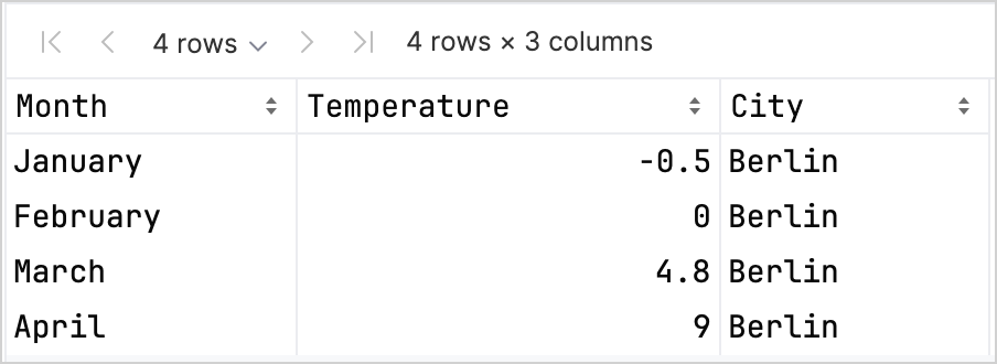
You can see that the DataFrame has three columns: Month, Temperature, and City. The first four rows of the DataFrame contain records of the temperature in Berlin from January to April:

To create a plot using the LPK library, you need to convert your data (df) into a Map type that stores the data in key-value pairs. You can easily convert a DataFrame into a Map using the .toMap() function:
Create a scatter plot
Let's create a scatter plot in Kotlin Notebook with the LPK library.
Once you have your data in the Map format, use the geomPoint() function from the LPK library to generate the scatter plot. You can specify the values for the X and Y axes, as well as define categories and their color. Additionally, you can customize the plot's size and point shapes to suit your needs:
Here's the result:
Create a box plot
Let's visualize the data in a box plot. Use the geomBoxplot() function from the LPK library to generate the plot and customize colors with the scaleFillManual() function:
Here's the result:
Create a 2D density plot
Now, let's create a 2D density plot to visualize the distribution and concentration of some random data.
Prepare the data for the 2D density plot
Import the dependencies to process the data and generate the plot:
%use lets-plot @file:DependsOn("org.apache.commons:commons-math3:3.6.1") import org.apache.commons.math3.distribution.MultivariateNormalDistributionPaste and run the following code snippet in your Kotlin Notebook to create sets of 2D data points:
// Defines covariance matrices for three distributions val cov0: Array<DoubleArray> = arrayOf( doubleArrayOf(1.0, -.8), doubleArrayOf(-.8, 1.0) ) val cov1: Array<DoubleArray> = arrayOf( doubleArrayOf(1.0, .8), doubleArrayOf(.8, 1.0) ) val cov2: Array<DoubleArray> = arrayOf( doubleArrayOf(10.0, .1), doubleArrayOf(.1, .1) ) // Defines the number of samples val n = 400 // Defines means for three distributions val means0: DoubleArray = doubleArrayOf(-2.0, 0.0) val means1: DoubleArray = doubleArrayOf(2.0, 0.0) val means2: DoubleArray = doubleArrayOf(0.0, 1.0) // Generates random samples from three multivariate normal distributions val xy0 = MultivariateNormalDistribution(means0, cov0).sample(n) val xy1 = MultivariateNormalDistribution(means1, cov1).sample(n) val xy2 = MultivariateNormalDistribution(means2, cov2).sample(n)From the code above, the
xy0,xy1, andxy2variables store arrays with 2D (x, y) data points.Convert your data into a
Maptype:val data = mapOf( "x" to (xy0.map { it[0] } + xy1.map { it[0] } + xy2.map { it[0] }).toList(), "y" to (xy0.map { it[1] } + xy1.map { it[1] } + xy2.map { it[1] }).toList() )
Generate the 2D density plot
Using the Map from the previous step, create a 2D density plot (geomDensity2D) with a scatter plot (geomPoint) in the background to better visualize the data points and outliers. You can use the scaleColorGradient() function to customize the scale of colors:
Here's the result:
What's next
Explore more plot examples in the Lets-Plot for Kotlin's documentation.
Check the Lets-Plot for Kotlin's API reference.
Learn about transforming and visualizing data with Kotlin in the Kotlin DataFrame and Kandy library documentation.
Find additional information about the Kotlin Notebook's usage and key features.