Data visualization with Kandy
Kotlin offers an all-in-one-place solution for powerful and flexible data visualization, providing an intuitive way to present and explore data before diving into complex models.
This tutorial demonstrates how to create different chart types in IntelliJ IDEA using the Kandy and Kotlin DataFrame libraries.
Before you start
To follow this tutorial:
Select File | New | Kotlin Notebook.
In your notebook, import Kandy and Kotlin DataFrame:
%use kandy %use dataframeRun the code cell with the
%use dataframeline before any other code cells to make sure the DataFrame library and its APIs are available in the notebook.
To follow the tutorial, you can also use DataFrame as a Gradle or Maven dependency.
Create a DataFrame
To start, let's create a DataFrame with data to visualize. This DataFrame stores simulated monthly average temperatures for Berlin, Madrid, and Caracas:
Now let's create a new variable (df) and use the dataFrameOf() function to generate a DataFrame of three columns (Month, Temperature, and City):
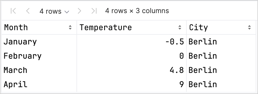
To preview the data, use the .head() function:
In our dataset, the first four rows store temperature in Berlin from January to April:
Create a line chart
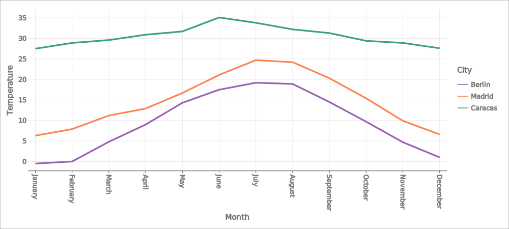
Let's create a line chart using the df DataFrame from the previous section:
Call the
.plot()function from the Kandy library.Apply the
line()layer.Map the
MonthandTemperaturecolumns to theXandYaxes accordingly.(Optional) Customize colors and sizes.
Here's the result:
Create a points chart
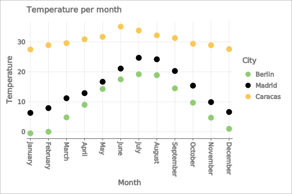
Now, let's visualize the df DataFrame in a points (scatter) chart:
Call the
.plot()function from the Kandy library.Apply the
points()layer.Map the
MonthandTemperaturecolumns to theXandYaxes accordingly.(Optional) Customize colors, axis labels, point sizes, and chart title.
Here's the result:
Create a bar chart
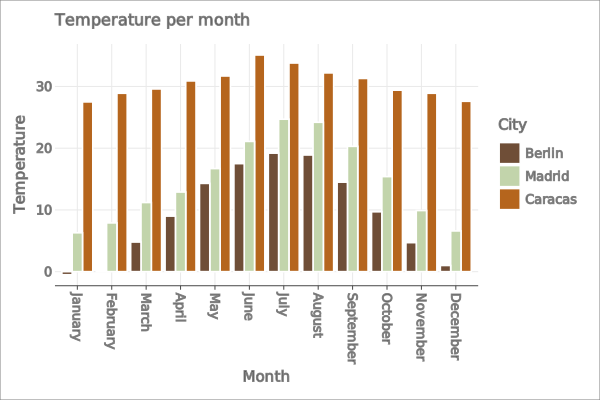
Finally, let's create a bar chart for each city:
Use the
.groupBy()function to group the DataFrame by theCitycolumn.Call the
plot()function from the Kandy library.Apply the
bars()layer.(Optional) Add a title for the chart, customize colors.
Here's the result:
What's next
Explore more chart examples in the Kandy library documentation
Explore more advanced plotting options in the Lets-Plot library documentation
Find additional information about creating, exploring, and managing data frames in the Kotlin DataFrame library documentation