You can add a tooltip to any component using the TooltipArea composable. TooltipArea is similar to the Box component and can show a tooltip.
The TooltipArea composable has the following main parameters:
tooltip, composable content of the tooltip.
tooltipPlacement, defines the tooltip position. You can specify an anchor (the mouse cursor or the component), an offset, and an alignment.
delayMillis, time in milliseconds after which the tooltip is shown. The default value is 500 ms.
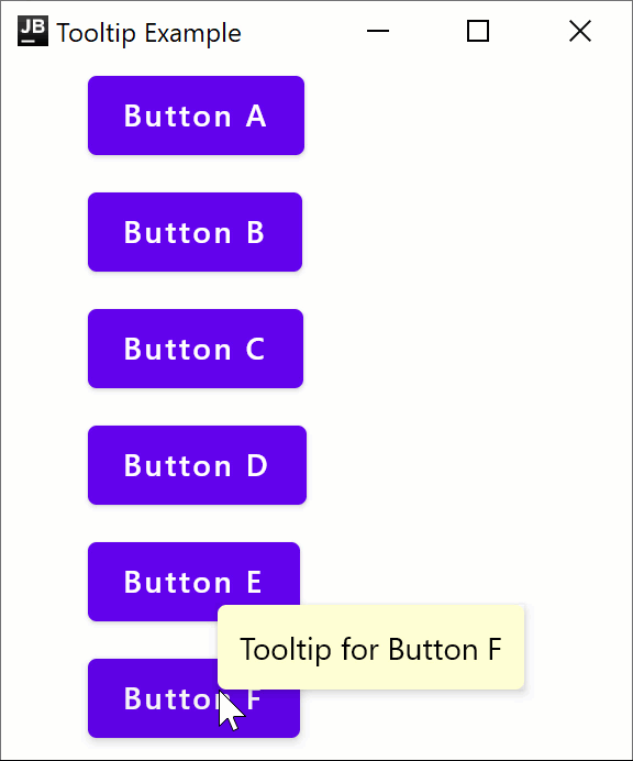
The following example shows how to create a simple window that contains a list of buttons, each wrapped in a TooltipArea. When you hover over a button, a tooltip with the button's name will appear. Add this code to the main.kt file in jvmMain/kotlin: